Tuesday, April 23, 2013

["Collage" will be added later]-
Has flowers, a scene as an "edge of the world", and a Big Yellow Taxi"


"Don't it always seem to grow..." by Alexis Rand


The lonely white flower sighed as she thought over her recently made mistakes.

She remembered the way she yelled at the yellow flower, and the way she told him to grow somewhere else. She was tired of the same flower always being near her. Everyone needs a change of scenery sometimes, right? She wished she had approached it all better. Wished she had told him that she needed to grow somewhere else, calmly.

She told him she promised to come back. Promised to stay alone and see the sights without any other flower. But she didn't keep that promise.

She became tangled up in the stems of other plants. She saw their pretty colors and thought "Wow! They would compliment my beautiful white and yellow petals and I should keep them around." But they were weeds in disguise. And soon, spending time with them made her petals all fall off, and she started to grow as a weed, too.

She saw the yellow flower from time to time while she sprouted her thick, weed-like petals. She had no clue of her transformation, and so she thought nothing bad was coming of her new friends. But the yellow flower could see right through her. And he didn't like it.

When the white flower was fully coated in thick, dark green fibers, she finally realized what had happened to her. She saw how ugly she had become. And she wanted nothing to do with her new "friends" anymore. She returned to the old patch of grass on the edge of the world, but the yellow flower was no where to be seen.

After some searching, she found her yellow friend, still as beautiful and thriving as ever. But he didn't want to be friends with a weed. He wanted his lovely white petaled friend back. He told her that it was he who didnt need her now. He now knew he was beautiful on his own, and he didn't deserve the way the white flower always yelled at him and put him down. And she began to sob.

She cried and cried and regretted ever leaving his side, here on the beautiful edge of the world. She cried so hard that she started to cry away her green blotches, and her white petals came back. She was now better than ever! She knew what she did wrong, and she wanted to make it right.

But it was too late. The yellow flower knew how easily she could turn in to a weed. He saw her as a whole new flower. He couldn't unsee it, couldn't take it back. It was mortifying.

Slowly, with very much time, the yellow flower grew a little bit closer to his white friend.  (Both figuratively and literally). He saw that maybe, in even more time, they could be close again. She really was sorry, he realized.

She wished he would grow closer still, and though it made her ache inside, she waited patiently, as she had never done before. Her yellow friend was worth waiting until the end of time for, because up there on the edge of the world, he waited for her for so long. He deserved to be treated right by the best kind of friend out there, and that's what she would be from now on.

It still ached, waiting, though. And wait she would do for a very long time. Up on the edge of the world, with her roots in the ground, she stayed and sighed and looked into the sky, wondering just what would happen next.


Wednesday, January 23, 2013

Piet Mondrian

Our midterm is pretty much the same as last year, a post & in class assignment based on an artist. I think I put this off so much because I didn't enjoy doing it last year, and I'm still tired out from focusing on Edgar Degas. Anyway.

This year, from a list of 50, I have picked Piet Mondrian. I think it's interesting how he made paintings that looked so simple, yet really meant much more, like myself. I think I might regret picking him, seeing as how I have to do a "notetaking page", and I feel Ill use all my ideas on that, rather than in class.

"The Grey Tree", my favorite of his work.
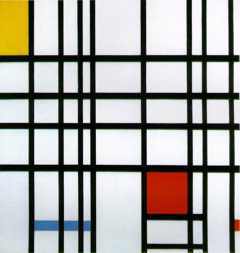
Piet was born in The Netherlands in 1872. Growing up with an artistic father and uncle, art came to him easily and was always an interest of his. As an adult, his career was in education, with painting still being a primary key to his life. He always painted with symbolism and representations. Soon, he felt a passion for cubism developing, and moved to Paris. He dropped an extra "a" from his name (previously Mondriaan), and began to paint less representationally, but with more shapes and figures. While visiting home in 1914, WW1 had begun and he was forced to wait out the duration of it back in The Netherlands. He gained the term "Neoplasticism", his new style, which he is most famous for. Lines & squares, some with primary colors, mostly cover his canvas, and to describe his paintings and feelings, here is a quote of his written in a letter: 

[I construct lines and color combinations on a flat surface, in order to express general beauty with the utmost awareness. Nature (or, that which I see) inspires me, puts me, as with any painter, in an emotional state so that an urge comes about to make something, but I want to come as close as possible to the truth and abstract everything from that, until I reach the foundation (still just an external foundation!) of things… I believe it is possible that, through horizontal and vertical lines constructed with awareness, but not with calculation, led by high intuition, and brought to harmony and rhythm, these basic forms of beauty, supplemented if necessary by other direct lines or curves, can become a work of art, as strong as it is true.]


"New York City"
"Composition with Yellow, Blue, and Red"
As a painter, I understand completely the compelling urge he speaks of. I love that he has put this into as basic a  statement as possible while still properly depicting the passionate feeling one gets when they want to paint. 

In 1919 he moved back to Paris, and stayed there for another 19 years. During this time he continued to develop his style and play around with the white/line/color ratio. 

Mondrian left Paris in 1938 in the face of advancing fascism and moved to London. After the Netherlands were invaded and Paris fell in 1940, he left London for Manhattan, where he would remain until his death. **

Before his death, he began to continue his vertical/horizontal line paintings, but rather than have the color of the line always be a black or dark grey, he began to play around more with primary colors, adding depth furthur into his paintings. 

Piet Mondrian died of pneumonia on February 1, 1944 and was interred in the Cypress Hills Cemetary in Brooklyn, Ney York. **
It will be interesting to attempt a "book page" with his influence. Now to work on my "notetaking" page..


** Taken directly from an online source due to lack of better wording. 

Monday, January 21, 2013

Empty Bowls

I'm going to attempt writing this while also helping to write a play for another class. Rad.

We're doing an "Empty Bowls" dinner at school on Feb 9th. Basically it helps support the hungry, and I think it's a wonderful way to help. I'm disgusted by almost all pasta, but apart from that, it's a phenomenal idea. 

A lot of kids that do charitable events help out because it looks good for college purposes, and not much else. I hate that. I don't see why doing things like this is something one can't do on their own.

I love that the bowls are handmade and the meaning behind every aspect of the event.
   It all makes me wish I got off my butt to do more.

Many fall under the poverty line here in Jersey, and something needs to be done to fix that. Hunger shouldn't be existent anywhere, especially with all the resources we have on Earth. Ignorance is the only cause I can see, and I love that at HTHS we're going against that.

Myself

Asked to answer a series of questions about myself, I decided to take it into someone's eyes that weren't my own. I know what I look like to myself. I know who I truly am. I know that I wear what I wear because I like it, I shave my hair because I like it this way, and I got my piercing because I think it looks fantastic. But that's not what everyone else thinks, and I know this, too.

I drew my blind contour drawing in the eyes of an average adult, or the spitting image that their children come out to be. They see me as someone who craves attention and will regret my choices later down the road. I know this is not true.

When someone who does not know me looks in my direction, they notice the flambouyant hair color I tend to have and the lip piercing I wear with confidence. They do not notice my colorful eyes or the freckles I bare. They notice nothing of the real me. My "outstanding features" tell them I am a teenager and I have many problems with myself and those around me. I do, in fact. But my problems have nothing to do with my appearance at all, and I have no clue why someone could see my style as "lashing out against society"...I do that with my words, not my hair. Silly people.

The words flow together, and the colors & arrows direct the viewer to which way I am speaking. I'm not a fan of bright colors, and so the colored in text symbolizes that it is false. The only truth to my drawing is the text that is in pink: I do not care what you say.

Tired.

I've let my personal problems interfere with my productivity, again. I thought I wouldnt do that this year, but that's also because my productivity levels are determined by my mood and (obviously) both are low lately.

I can't even remember what on earth is due for the blog assignments I havent done. I cant remember what homework of mine is due at all. Im dreadfully tired and Im still using this blog as a way to talk about myself, not just my art. I still dont know if thats good or bad but I guess Ill continue anyway.

So so tired..

Wednesday, November 14, 2012

Governmental Collage

So this year, as you probably already know if you for some reason are on my "Art Blog", the art minions had to do a collage to represent their feelings on a topic relating to the upcoming election. (Politic project).

I care most about Gay Rights and how, of course, they are almost nonexistent with today's (generally) close-minded society.The collage I have made is more symbolism instead of just a pretty picture, as usual. I care very much about this project and topic, and please, excuse me if I go into too much detail or bore you with the length.

Things in my collage, along with the obvious "gay" symbolism (rainbow, male&male symbols, etc.)

-The word "Bizzare" and a definition from an old vocabulary book of mine. The definition reads as, "Weird or fantastic", and that is just what I find homosexuality and coming out to be. Not weird, not fantastic, but a combination of the both.
-The statement, "Find a new adjective", which is extremely important to me, because it is speaking about the use of the word "gay" and how today the word is used to describe something "odd" or "stupid" in a very negative way. "Gay" should not be synonymous with "Crappy". At all, for any reason.
-"The RIGHT to pursue HAPPINESS" in stenciled letters. Marriage is a form of pursuing happiness, and I think it is an abomination that people want to take that away from other people. I thought we lived in a "newer world", but apparently the only discrimination that has been lifted from the law is minorities...and that still exists. What an evolution.
-A giant swirl-like white portion of the paper (I cannot describe it in words), with a peach color on the sides. This is to represent that we are all still flesh and blood, regardless of orientation. The swirl is there as apposed to a straight line, which would represent heterosexuals.
-The "fog" above all these words is to represent the fact that most people ignore all the underlying factors of why all people should be allowed to get married.
-The "dripping" coming off the side was, honestly, just to look pleasant, but within the design are all the principles that build a marriage, and all things everyone hopes to get when in love, such as: acceptance, sympathy, love, desire, compassion, etc.

Stressful as it was, this topic is one of those that matters to me the most, and I'm glad my hard work shows it.


My thoughts

So, I actually managed to do the aforementioned projects within a day, and though they weren't easy, I am proud of myself for accomplishing so much in such little time.
I have no pictures as of right now, for I am typing on a school computer and an SD card slot is not available. I wish you could see my collage, even though it is no where near my favorite artwork of mine.

This post has art in it, but is not necessary, as other posts are. This is a "if you really care enough to read stuff on my blog" exclusive. Hoo-ray.

Ms Hanlon gave me $20 to buy the canvas I need and paint her an abstract work of art. This excites me for I already know what I want to use the $10 profit on. Babies-R-Us called me last night about an interview on Friday. I hope I get a job. I need money to buy my friends Christmas gifts.
 The "Friends Of Rachel" club is handing out lollipops for free sometime soon with cute quotes attached to them about friendship and acceptance. I thought of the idea, and I must say I'm honestly quite proud of it.

My "icon" on blogger is a painting I made over the summer. Here's a picture of it:
I'm calling it: My Purple Painting for a lack of a better name at the time I made it. I don't really name them abnormal things. I haven't signed this one, either. I don't plan to sell it until I'm older, if at all.

I wish more people appreciated paintings/had the money for them.

I want to sell my Green Painting and the Element-esque Painting as well, but they are both my favorites and no one elses, apparently. Oh well. Maybe I'll keep them until I'm older since I love them so much.

I'm not good at drawing or painting pictures of THINGS, I realized, because that's not what I'm interested in. I have no talent in this department.
I love colors and this is why I care about abstract painting. The colors blend and create such wonderful beauty. I have no objection when I paint besides color codes.

I've been thinking a lot about what I want to do after highschool, lately.

These are all my current thoughts. 

Tuesday, November 13, 2012

ERMEGERD...SHOES

So, I never did this post because I never finished my "Shoe drawing" and I never found it when I lost it in my room until now. I plan to work on my shoe drawing today, and pictures will be added later.
I care not for that assignment, I must admit, for I don't find it to be an interesting drawing at all. I like where my shoe looks now, though, due to the tint of the paper it is drawn on and the style of shoe I had drawn.
I haven't been caring about art much this year, honestly, but that's going to stop and tomorrow morning I plan to hand Mrs. Kiick 2 completed assignments, both my drawing of a shoe that I'm not too fond of, and a presidential collage, which surprisingly I'm finding more frustrating than anything. I'll keep ya posted soon enough.


EDIT:

I did the shoe drawing and the collage, as planned. Unlike everyone else's show drawing, however, mine did not shade, although that was the initial assignment. I had lost my drawing until after it was due, and even if I hadn't, I can almost guarantee I would not have shaded the shoe in, due to my lack of desire to. Shading isn't for me, and I learned this last year, whilst trying to shade in drawings at the end of each marking period. Yuck.

I ended up coloring in (very thickly) the laces of the shoes, and for the most part, anything that was originally white. However, the Converse star is normally surrounded by white, and I left it this way. 
I do not hate it as much as I had originally, since I did not follow the "rules", honestly. It's not too bad a drawing.


Monday, September 10, 2012

I have arrived.

I'm back! And art is fantabulous! I spent some time over the Summer painting pictures that I'm somewhat fond of, and wasting my life away. I am okay with this.

But now, it is time to wake up every morning at 6:30am and get back to school. Though this year things are going to be much much much different. I say that a lot, as all children do, but I'm actually setting it in motion this time. I'm doing extra curriculum and trying harder in all my classes -- the improvement is impressive and scary at the same time.

Art class will be, as it was last year, my outlet for all my stress and frustration of school and life in general.

My blog is my release into even farther comfort.

I can't wait to get started ^  u  ^

Tuesday, June 12, 2012

So I'd already made this post & of course a wild kitten appeared and stepped on the keyboard deleting all progress. That happens often nowadays..

This year started out terribly. I never came to art class, handed everything in late, and was about 100% unenthusiastic. It appears that the end of the year is ending this way, as well.
I have realized this and plan to cease this process before it gets out of hand and drags on to next year.

Next year WILL be different. Many kids say this and then never change anything. I am known to be one of these kids.

I have reason to do otherwise this year. I have become more self aware in one school year than I thought possible in any human being. Whether my emotions are negative or positive, I am learning to control them and this is a huge step forward in all aspects of my life. Teachers, friends, and art have helped me discover who I am at a brilliant speed. Now all I have to do is use this knowledge to my advantage and fix all the broken parts of me I had thought were over and done with.


I will be a better person next year. My art experience has been a self journey, rather than an actual art experience.


 Art class is a drug for me. It temporarily dulls the pain of life, causes some stress, but in the end I say "Ill do better tomorrow", & I stick to what I'm doing.


I will continue to rely on art next year as I will for the rest of my life.
Without my sophomore Creative Arts class, I never would have realized this, among other things.


Next year should be a good one. 

Friday, January 20, 2012

Edgar Degas


Edgar Degas was a French artist born on July 19, 1834 in Paris, to a family with 4 other siblings. His mother had died at a young age, leaving his father and grandfather to be the adults of the home. Degas had gone to law school to please his father, soon leaving, and going to an art school instead. Neglecting to stick to this plan, he then traveled for three years in Italy. After the Franco-Prussian War in 1872 was over, he began to stay with his uncle in New Orleans. Just a year after his return to Paris, his father dies, and it is discovered that his brother has astounding business debts. Degas must then attempt to make art for the purpose of selling it, upon also losing his home, and a number of artworks he had inherited to help restore his family’s name. Many years later, once all the debt was settled, he was able to buy a number of artworks from some of his favorite artists. He grew a passion for photography and had a taste for working by lamplight, as depicted in many of his paintings. He never had married, and spent the last days of his life in Paris before dying September of 1917.

~I like this artist because when I first looked up his work, I looked up his portraits. His portraits, it turns out, are known to be depictions of human isolation, which is something I favor. When I then moved on to the other paintings of his, I was intrigued by the lighting angles, and how he paints the different lighting on each woman’s body perfectly,(in his paintings of ballerinas,) as if to bring you into the actual show itself.


  The Star
What stood out, to me, in this picture is the fantastic lighting and detail. Though it’s not too apparent what’s happening in the background, it’s easy to see that he focuses on the lighting reflected in the ballerina’s tu-tu. This shows you where the light is coming in, causing the shadows on her torso, which gives it a more real feeling.


Stage Rehearsal
This picture stands out to me because of how much action is going on, but even more so, how real it seems. The floor is what really caught my eye, actually, because it seems so beat up and life like. The observers to the side are one of great criticism, it appears, while the ballerinas look as if they’re in chaos. The background looks as though they were preforming in some sort of cave, which is really captivating to imagine. This picture really brought me to the scene and seemed absolutely real, while still Degas still maintained the perfect shading to help create the effect.

Interestingly enough…
~Degas believed that "the artist must live alone, and his private life must remain unknown", living in solitude for the majority of his whole life. This led him to focus more clearly on his work, but seemed to have left him stranded from the advances of the world. He lived a successful life, but died alone, never knowing love, due to his dedication to his art work.

Thursday, January 19, 2012

I have all intent to hate this assignment.

I can't say much about the metals assignment. All I know is I'm far behind every single student. 
I'm still in the drawing phase, I guess you could say. I'm content with the design I'm working on right now, even though it's not much. However, 2 "fall-back designs" are what I don't have. My design is one that comes to me from my desire to make one thing mean a bunch of little things. My design, though I lack pictures currently, is one depicting my image of a SWIFT GHOUL!
By definition, (my definition, that is)
a swift ghoul is one who is sly and cunning, stalky, and extremely intriguing. They are captivating, usually gorgeous, and are able to convince anyone of anything. People are drawn to them. Said swift ghouls never use their power for good, I'm afraid, and are usually murderers. (Most vampires are swift ghouls)
ALSO, don't trust guys in top hats behind alley ways. They're up to ghoulish mischief, no doubt.
...they also walk funny.
The drawing shows their legs when they walk, their eyebrows when they're conversing with their victims, and also their teeth, (fangs, of course!)
           I'm not fond of metal work at all, and I am also very stubborn. I know this experience will not be a fun one, and my mind is stuck that way. I have only yet begun, however, so there's not much to say about my experience. 

-Insert witty title about collages here-

When we were first told of this assignment, I knew I'd have no problem. I'm all about metaphors and junk! And, low and behold, I was right. This project was only difficult in timing, because it seems to be a habit of mine to not be satisfied with my artwork, even when it's done and graded. I have, unfortunately, no pictures or the creative process, but just the finished "portrait". So, I suppose I'll just list the things that were incorporated into the collage.
-Dark vs light, light overpowering the dark in the end. The light was all earthy tones.
-A letter describing muhself, written from a genius. I had re-written the letter onto tissue paper, ripped it up, and used colored glue to change the appearance. I also had re-written a few journal entries shared between a friend and I.
-A "hot glue tree", painted with brown glue, and other color splashes. The tree had faded from black to brown. It also had lyrics of a song glued to bits of it.
-PRODUCTIVITY is a BIG thing to Alexis. So, that was the final addition to the piece. 


I am honored to have my collage on the school's website, also! (I have no other photo, for now) :3


I didn't have much to say about this process or finished project. I try to intertwine symbolism into everything I do, so this wasn't a very new experience. 

SNAP! Back to reality....I mean...my portrait.

What, don't like Eminem?

Did you know that I wrote this exact post TWICE now, and it got deleted both times? :D
Yeah. I'm angry. So, on behalf of my anger, this post may be...well, crappy. My apologies.

The last time I made an actual art post was..hmm...LAST YEAR!...(technically).

I left you off, dear adventurer, at a point of confusion. I was in a state of frustration at my colors an poor shading abilities. Now I must say, while the brown I had worked with worked wonders for my eyes, (see left) it just wasn't giving me the relief I desperately needed. Mrs. Kiick, upon noticing my frustration and desperation to catch up to the rest of the class, had something else in mind for me, and let me do what no other student was doing- a "dash of color" (Black, white, and one other color of no relevance). This was much more my style, and let me breath a little bit easier. Though I have no pictures of the finished project at hand, I have a few of the portrait while it was rearing it's end. 

Before inking, 
with the original picture
< -


After inking    - >


The end result, I cannot say I was fully satisfied with, but I feel I'm as close as I'll get. The criticism from my peers was enough to settle my nerves for now.

FINALLY! FINNAALLYY!

Finally, after so so many attempts at trying, I'm able to post things on mah Blogger! :D
I find this to be a wonderful blissful thing! I was extremely aggravated due to the fact that my blogs are always something I type, then review, to find my satisfaction. And I was satisfied, fully! I even made a Harry Potter reference! That's loyalty there, people. I mean, seriously.
BUT REGARDLESS!
I am back. Hello! Here I go, typity-typing about the necessary things in life---erm, art class. Life, perhaps. Not so much for me though. I am superior, don't forget. :)

:P

Evan's making lots of noise.

(  This is my test post :3  )

Thursday, November 3, 2011

ZAK ATTAK

I feel a huge thank you is in order, and what better way to do that than to make a post about it? :3

Thank you, so so much, Zach, for getting me to Art every day on time. Thank you for letting me use your phone for both taking pictures, 


and for your phone also being the model of my technology assignment.

Thank you for making me jealous at how phenomenal your talent is! I mean, c'mon, really? I have THAT to compare my art to? ->  So not fair.

(This post is....semi- art related, I guess)

Thank you for doing everything you do for me. Thank you for surprising me every day with notes, or with what I discover in my lunches. Thank you for meeting me at the most irrelevant places throughout the school day, and thank you for being on the same intellectual level with me. Thank you for our deep conversations, and thank you for our silly ones. Thank you for failing spanish with me, porque neither of us pay attention. Thank you for soooo much more mushy junk.

Thank you for being adorable, and thank you for being mine. And Much love,
Lex <3

I don't like portraits.

I don't like portraits. Plain and simple.

We've been working on this thing called "Tempera Batik", my dear viewer. (Chances are, if you're reading this, you're either Madame Kiick, or another HT Art student, so you're well aware of what I'm talking about.

I don't enjoy this assignment for one reason: You are your worst critic.


I learned that this statement is in fact true, through much irritation. At first, we had to re-create ourselves at a much larger scale than our original photo. That was hell enough. I get very frustrated very easy when it comes to art, and so many spots of my face were just not coming out how I had wanted. 


The shape of my face, for example. My chin just looked so off, for so long. I avoided it until I was finished with the rest of my face...BIG MISTAKE. It turns out, the reason it looked so wide and far from my lips, was because I had proportioned the entire face wrong. My eyes were up just a taaaaad bit too far, but that tad bit made a HUGE difference. I ended up having to re-do all of my face. Sounds fun, right?
Nope! I'm just thankful I could get work done 11th period.
  My biggest problem I could say was probably my eyes, but I now know how to draw eyes much more sufficiently. The placement, as I said, was all off. Plus, my amount of makeup had a big effect on the outcome:

Painting is a whole new story. A whole new level of frustration, rather.
I decided to try a blueish gray color, with a tint of green. Though I thought it would work when I saw the color pallete, on paper was a different story. The blue turned out more gray than I had hoped, and when I looked around, I noticed many pupils had picked a blue-esque color. I was convinced that blue wasn't for me.

I'm currently working on a brown, that I believe has what looks like the tiniest hint of yellow. I don't like painting much, when it comes to the shading of my face, especially when I only have intervals of 45 minutes every day to work on it. But I must say I'm enjoying the brown more than the blue, for sure. Looking at the other student's portraits that are a emerald green color, I'm strongly considering that as an option. Its a beautiful shade of green, and I would love painting my eyes with it.

As you can see, when I get bothered I get sloppy. The back painting is the one I am currently in progress with, apologies for it being in the back of the pile. (Blame the photographer--not me!)

This process that is very very time consuming, and I can't wait to see what the end result comes out as.